Identity Design . Branding
STUDIO TANJUN
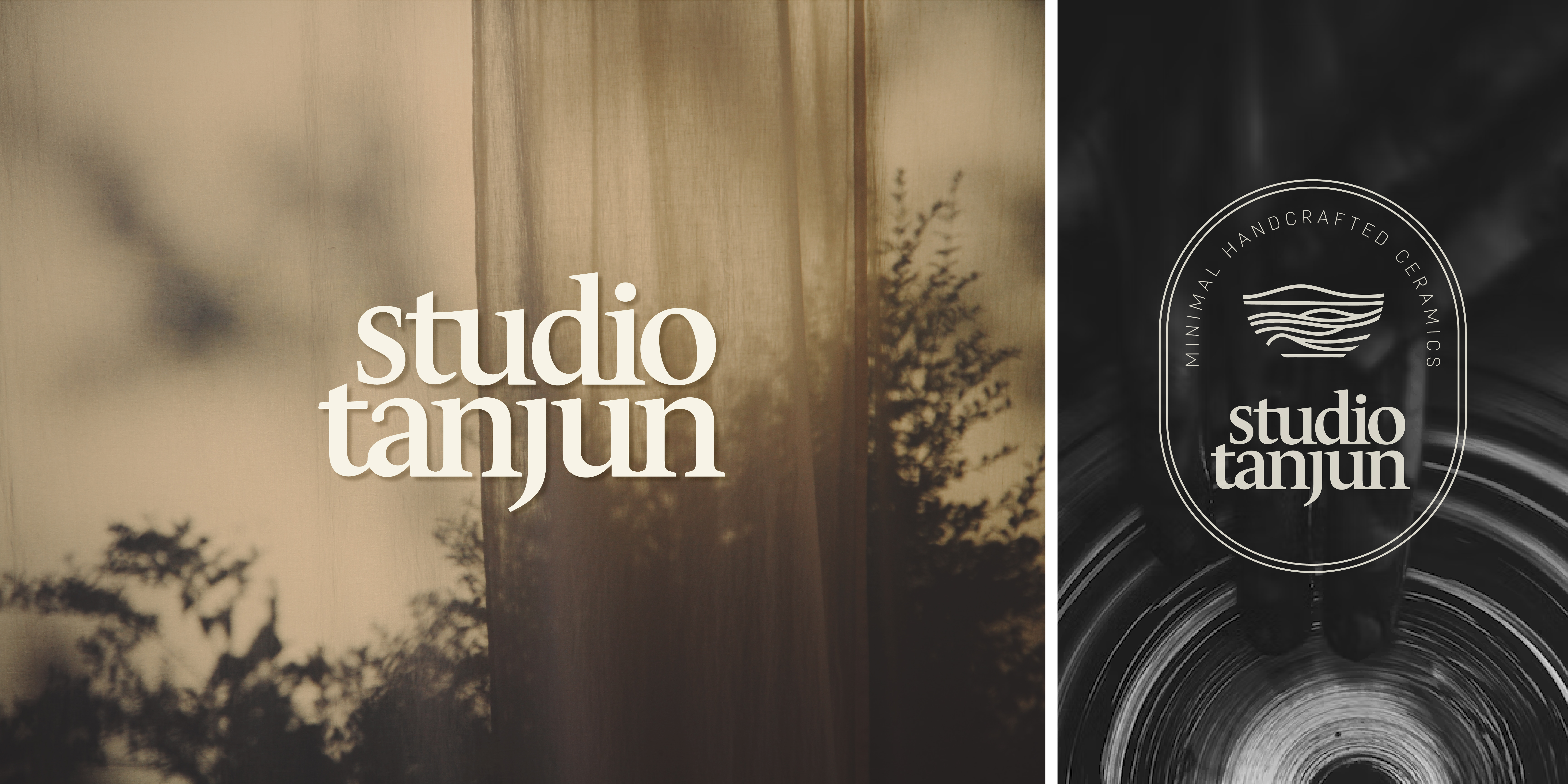
A pottery studio founded on simplicity and intentionality, Studio Tanjun is owned and gracefully led by an artist who has set out to create unique clay pieces that celebrate the interplay between texture and form. This project aimed to seek an identity that embodies her values of minimalism and clarity.
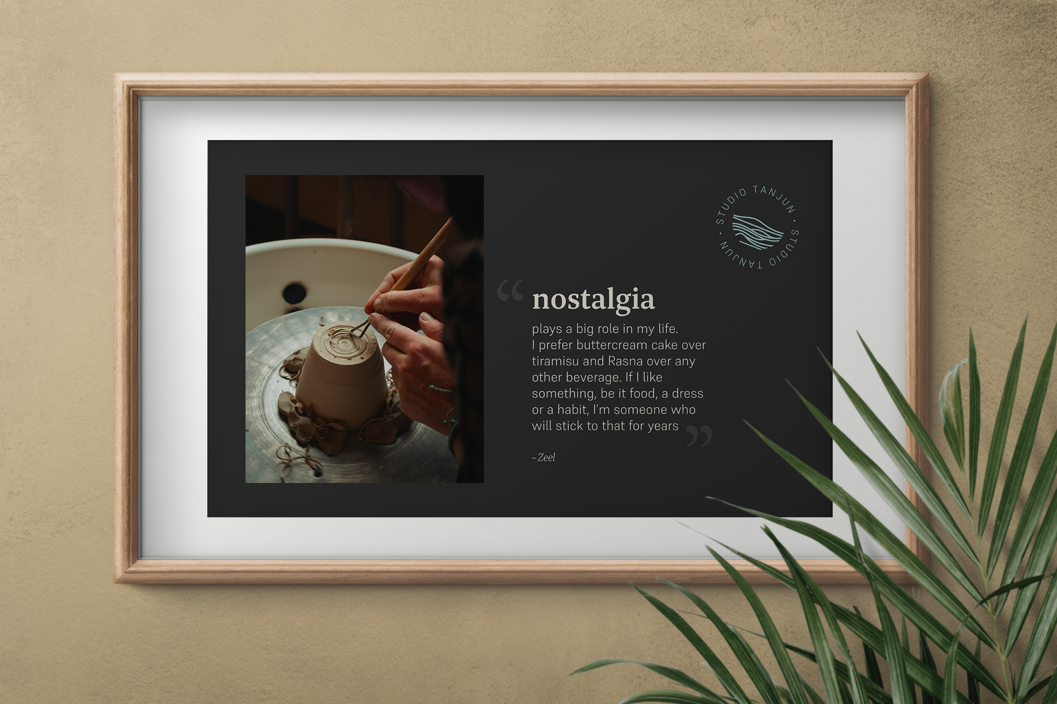
‘Tanjun’ is derived from the Japanese word meaning uncomplicated and simple-minded; ‘free of excess’ if you will. For the artist, simplicity also holds a special connection with nostalgia. She aspires to evoke a sense of comfort and familiarity through her pottery; to recreate that feeling of nostalgia for all who engage with her creations. I wanted to bring out this exact comfort through the identity.
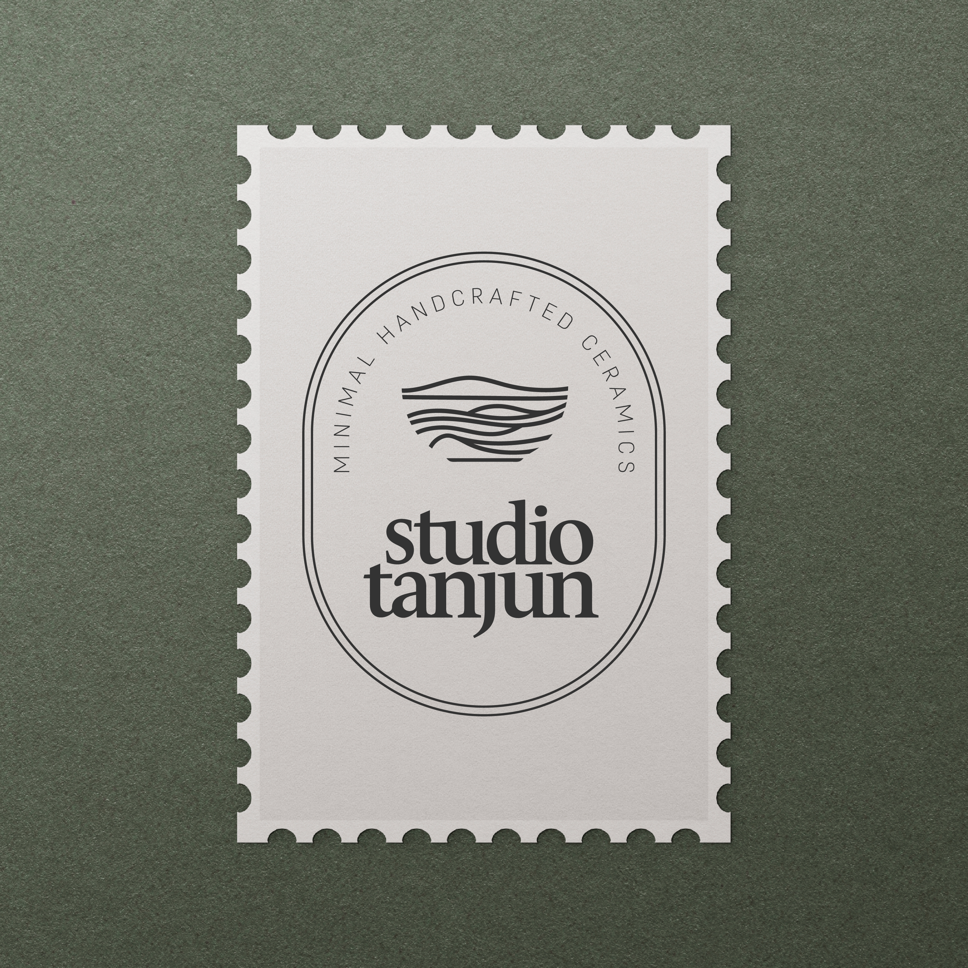
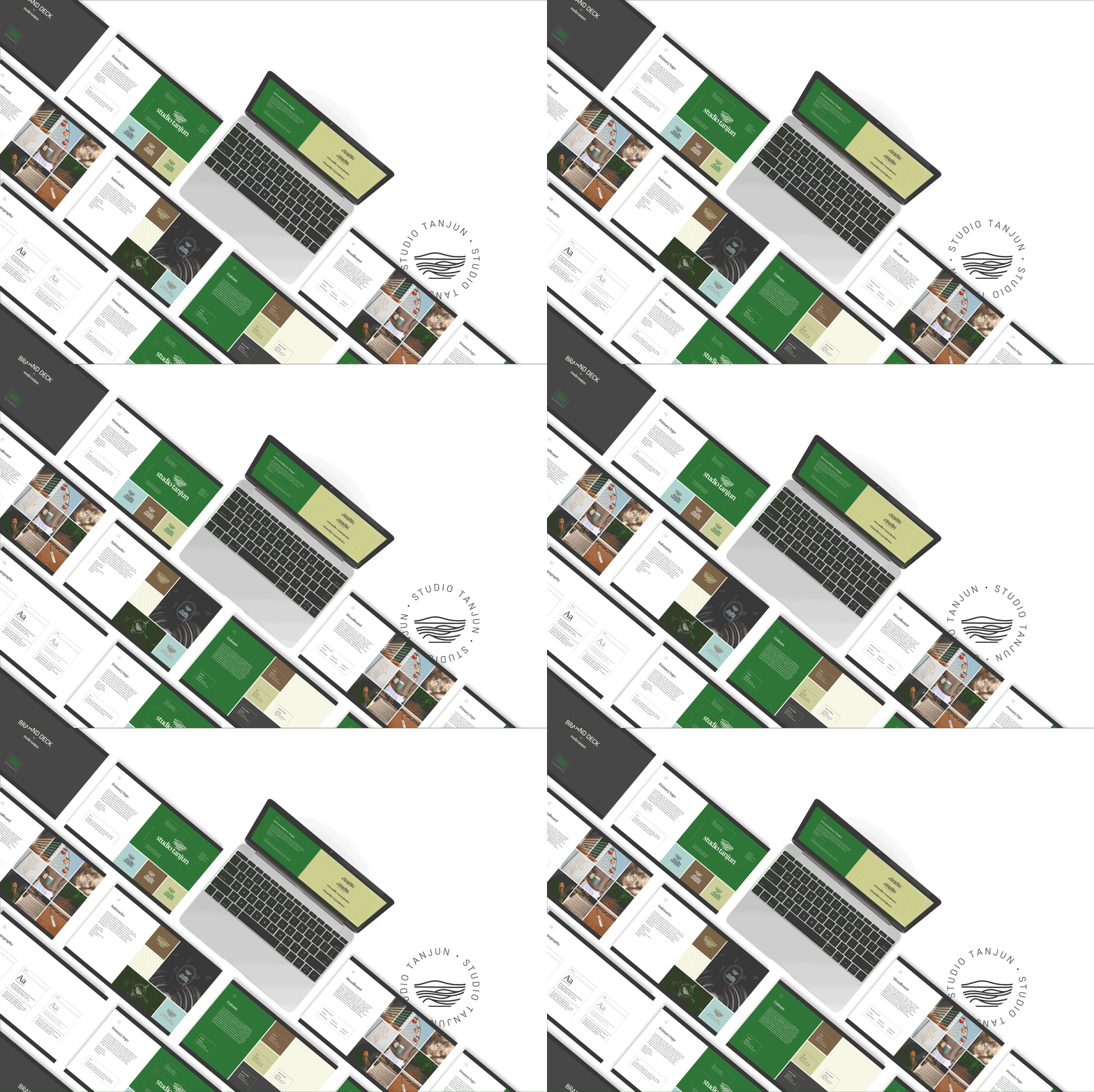
The approach was to keep it purposeful and minimal. A lasting serif font, a cosy arrangement of the letters in the wordmark, and an earthy colour palette were chosen to bring out the brand personalities effectively.
Studio Tanjun, Bhuj, India
@studio_tanjun
London, United Kingdom, 2023
Skills: Identity Design, Logo Design, Wordmarks, Composition, Typography, Adobe Illustrator, Miro
@studio_tanjun
London, United Kingdom, 2023
Skills: Identity Design, Logo Design, Wordmarks, Composition, Typography, Adobe Illustrator, Miro


©2023 PRANJAL GOKHALE